When it comes to building brand color palettes, there are two ‘main characters’: aesthetics and balance.
Aesthetics
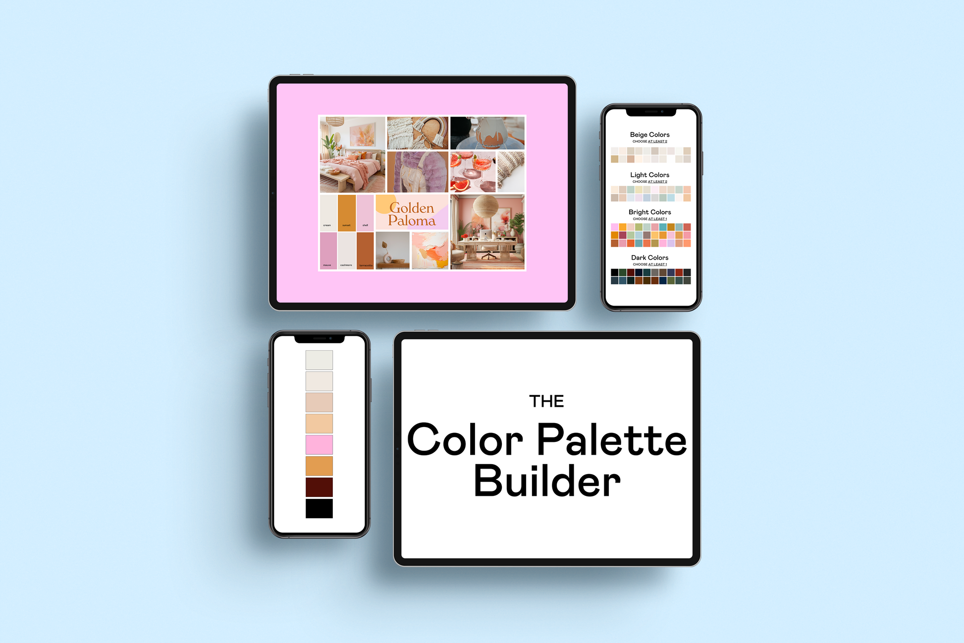
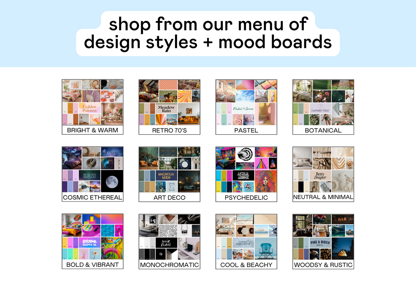
The ‘aesthetic’ of the color palette is the ‘vibe’. Is it bright and warm? Is it 70’s retro chic? Is it disco cowgirl? I often refer to these as ‘design styles’. To find an aesthetic, you’ll want to build a mood board around a central vibe or theme.
But we’re not really here to talk about aesthetics today. We’re here to talk about the other main character: BALANCE.
Balance
Balance is the often-neglected part of color palettes, but boy oh boy is she important.
Balance is how the color palette functions. A single color can make or break the balance of a color palette.
The great news is that EVERY single color palette is fixable. So, if you discover that your palette is unbalanced, you can fix it realllllly easily.
The key ingredient to balance a color palette: Color Contrast
Color Contrast
Color Contrast: color contrast measures the difference between any two colors. It’s how one color stands out from another color. You can never measure the contrast of ONE color, it’s ALWAYS measuring between TWO colors.
Contrast scores range from 1:1 (meaning both colors are exactly the same) to 1:21 (the contrast score of pure black and pure white).
To keep things SO simple- all you should know is that your text + background colors should have a minimum contrast score of 4.5. This ensures that you meet WCAG guidelines and keep your brand accessible.

Every pair of colors has a unique color contrast score, and it’s the same score no matter which color is the background and which is the foreground.

How do you ‘quantify’ color contrast?
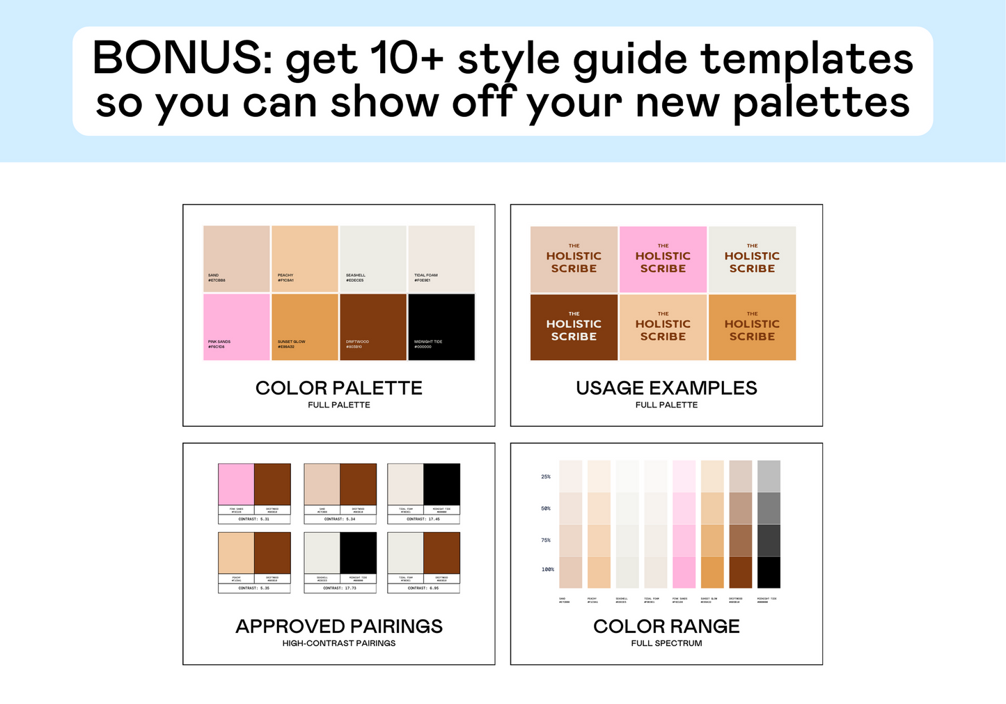
- There are tools for this! We’ve created several:
- Free Color Contrast Checker- this allows you to check the contrast score of any 2 colors. You can paste in a hex code or use the eyedropper tool to grab a color right from your design
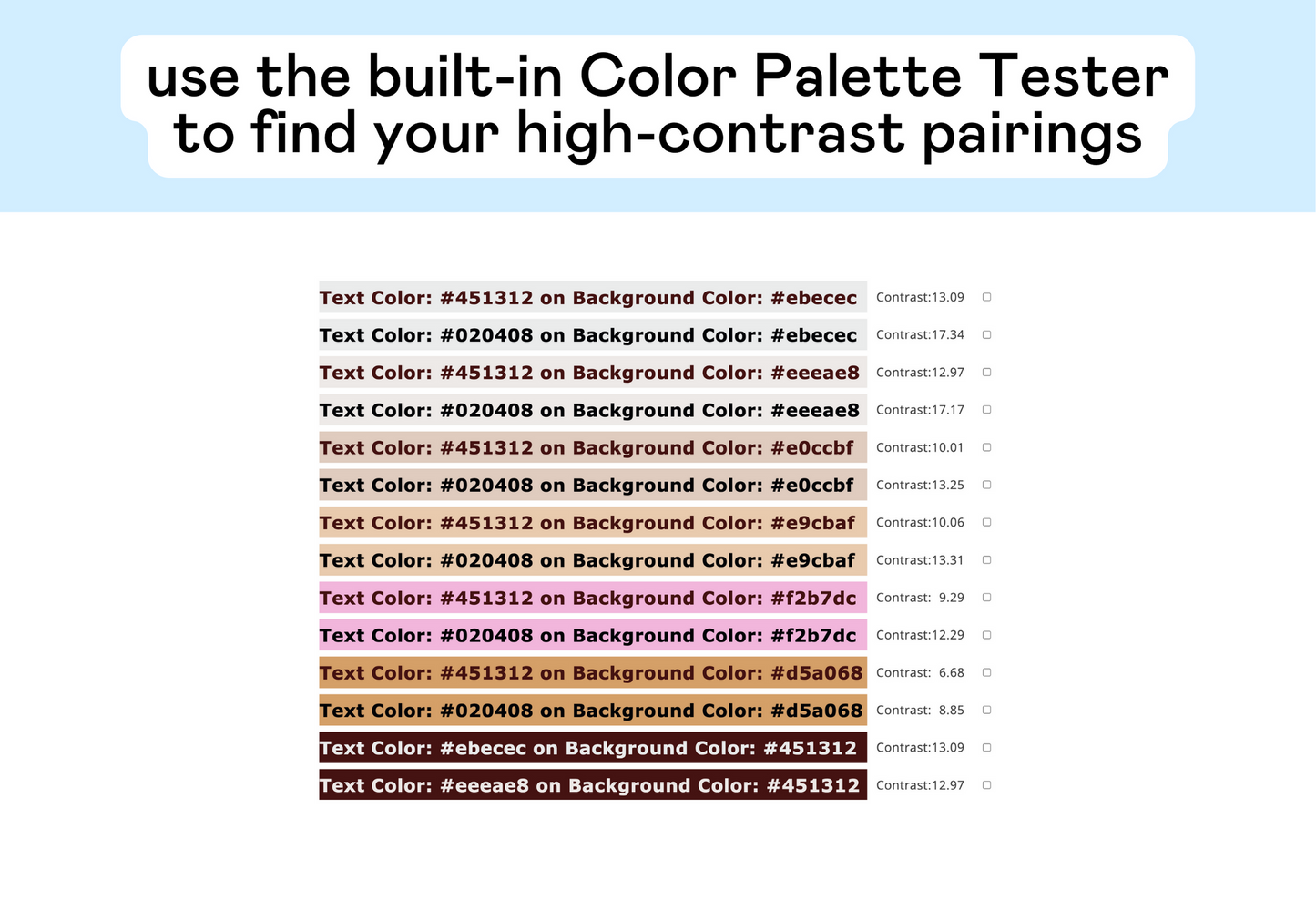
- Color Palette Tester- this is our hero product. It allows you to test ALL of the colors in your palette in one simple click and it will show you all of the high-contrast pairs (so you don’t need to check them all individually)
What a ‘balanced’ color palette looks like:
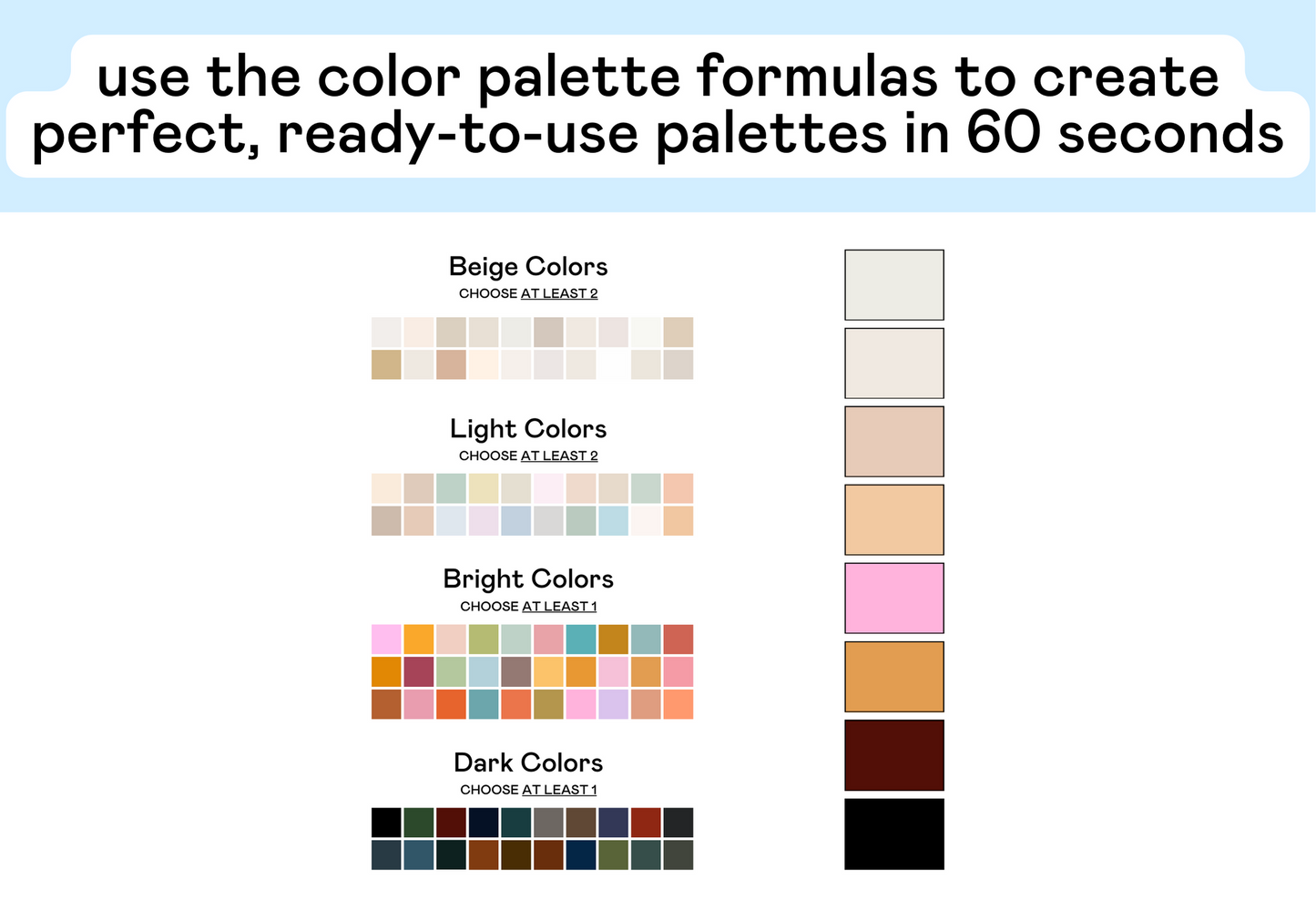
- At least 2 colors. I honestly prefer a color palette with 5-10 colors, but you cannot have a balanced brand color palette without at least 2 colors.
- and yes, black, white, and greys count as ‘colors’
- a mix of light and dark colors. Your color palette doesn’t need to be ALL light colors or ALL dark colors, but you need at least 1 of each. This is important for contrast.
- as long as you have those items, you’ll have a balanced color palette. Everything else boils down to aesthetics.
A mix of light and dark colors:
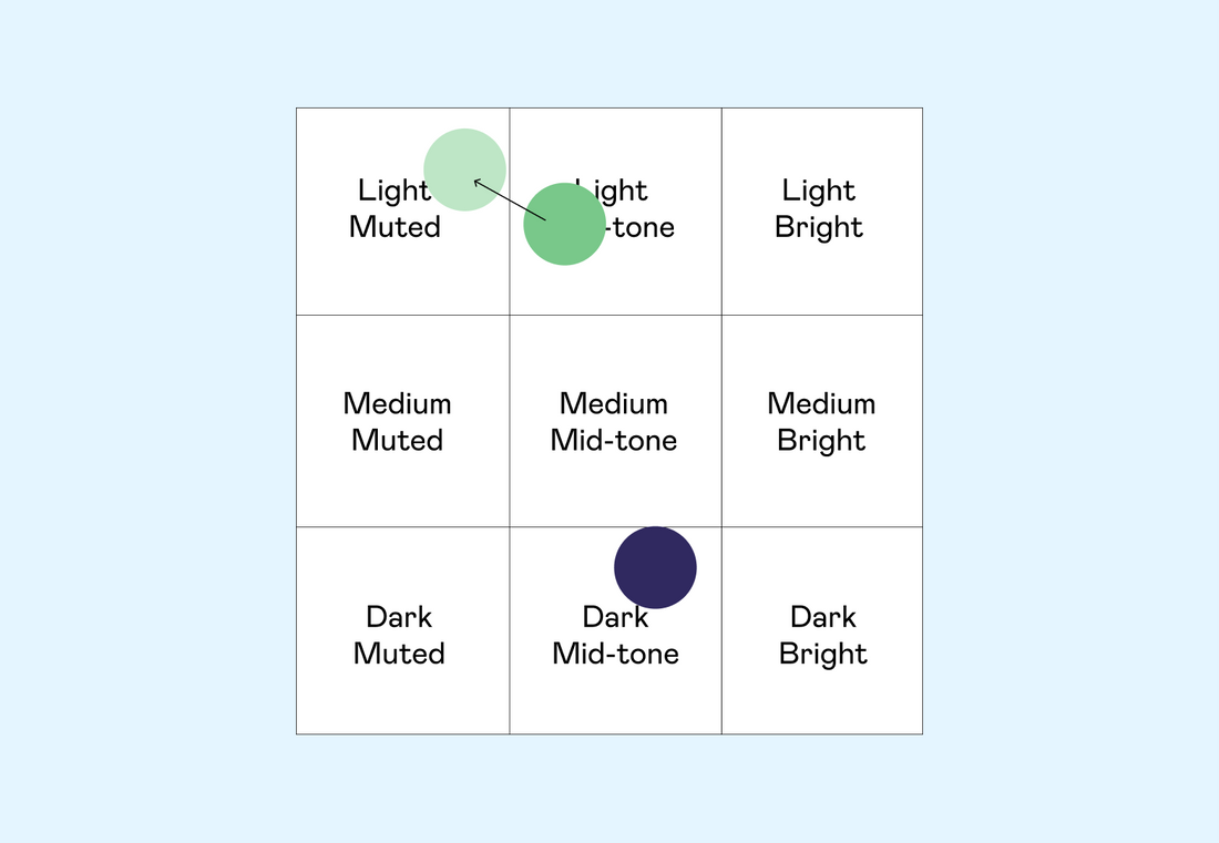
In my last video, ‘Hue, Saturation, and Luminosity’, we explored how to split the Hue Spectrum into 9 sections:

Now, we can use these sections to guarantee that we have a balanced color palette. All we need to do is make sure that we have at least one color from these light sections (in purple) and one color from these dark sections (in green).

Note: these colors don’t have to come from the same Hue! You just need at least one of each in your full palette.
So, let’s play around with this:


Closer = Dangerous
Note: the closer your two colors get to one another on the Hue Spectrum, the smaller the contrast. If you find that your contrast levels are getting too low, just move one of the colors further away (make a dark color darker or make a light color lighter).
Example #1: See how the two colors are close to one another?

Example #2: If you move the pink more towards 'Light Muted' the contrast score will go up and make it more usable.

The Danger Zone
The Danger Zone: You don’t want your only light and only dark color to exist in this square bc then contrast will be very iffy.

BEFORE:

AFTER:

So. How do you actually build a balanced color palette?
- Choose the aesthetic or vibe. Find a design style, make a mood board, etc. Figure out the general aesthetic you’re going for.
- Add any colors that you want, as long as they fit the ‘vibe’. You can choose 2 colors or 10 colors, it’s really up to you and how you’ll use the palette.
- Finally, check to make sure that you have at least 1 light color and 1 dark color.
- Check the contrast scores of your palette to make sure you have high-contrast pairs.
When it comes to brand color palettes, you want to make sure that your palette is balanced with a mix of light and dark colors. You should have a minimum of 2 high-contrast pairs to use on your marketing materials.