Here’s something that I wish more people understood about brand color palettes:
you should think about HOW your brand colors will be used.
Let me explain. ↓
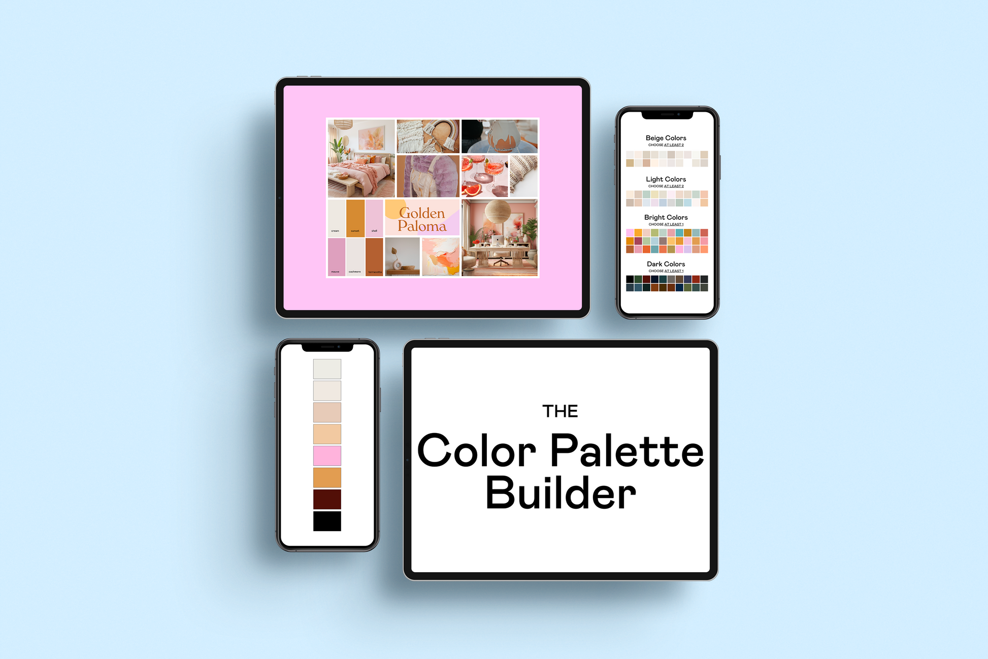
Let’s say you build a gorgeous brand color palette. Your palette is perfect:
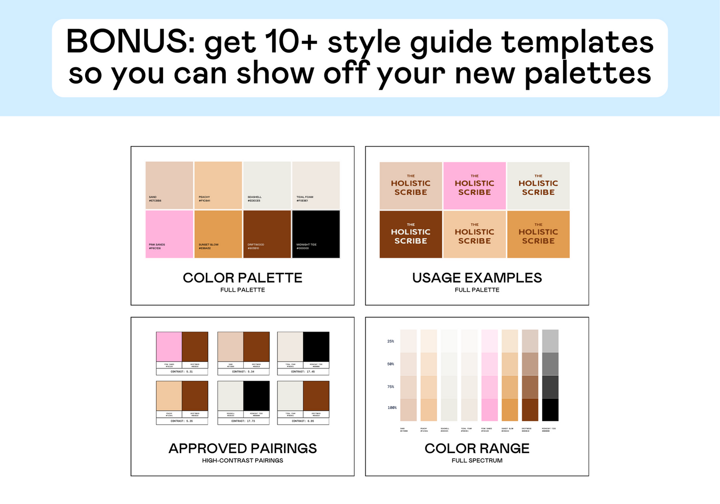
✓ You selected 5-8 colors for your brand color palette
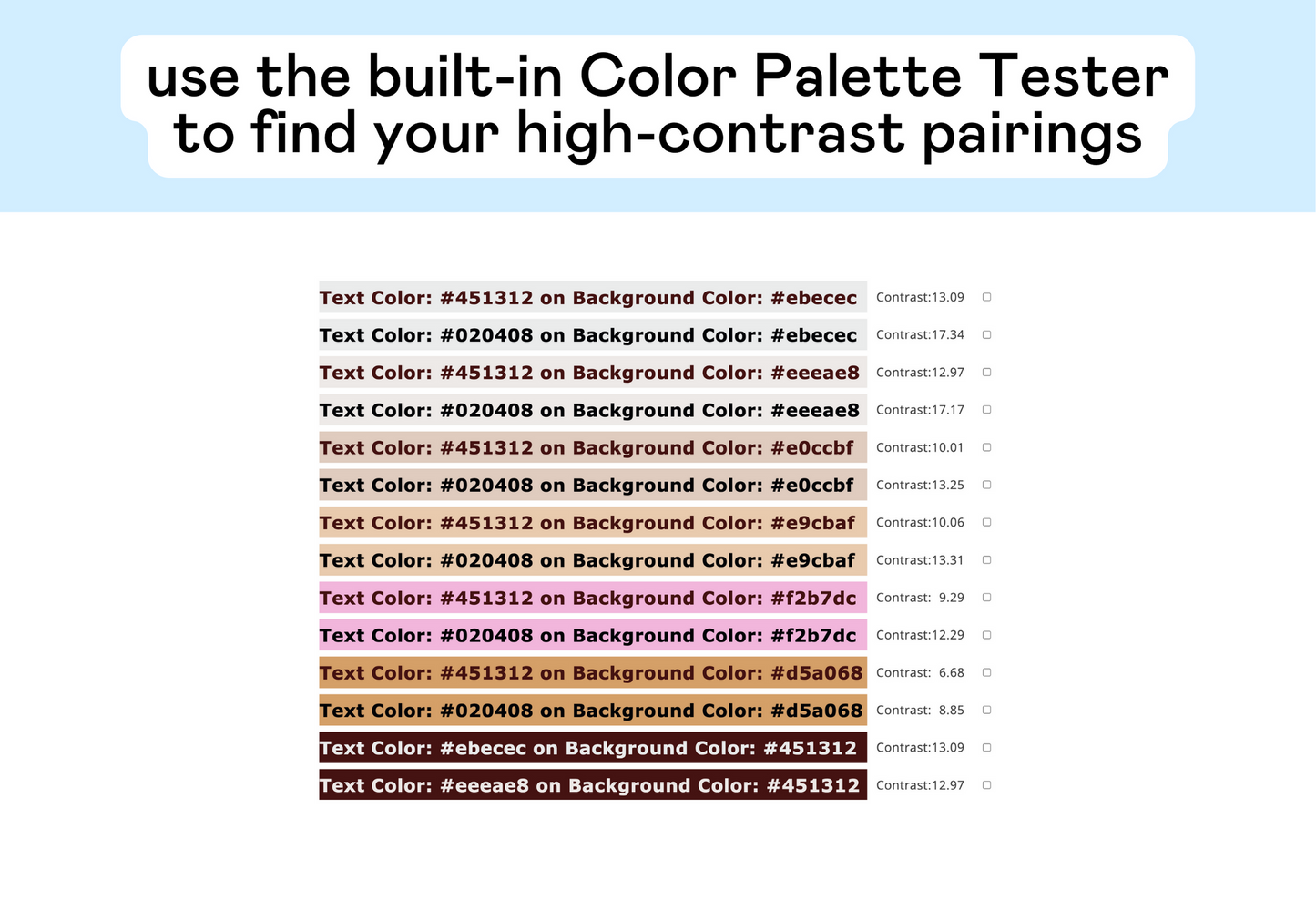
✓ you have a range of color pairings that have a 4.5+ contrast score
✓ your colors match your brand personality and will help you target your dream clients
So, you’re done, right?
Not quite.
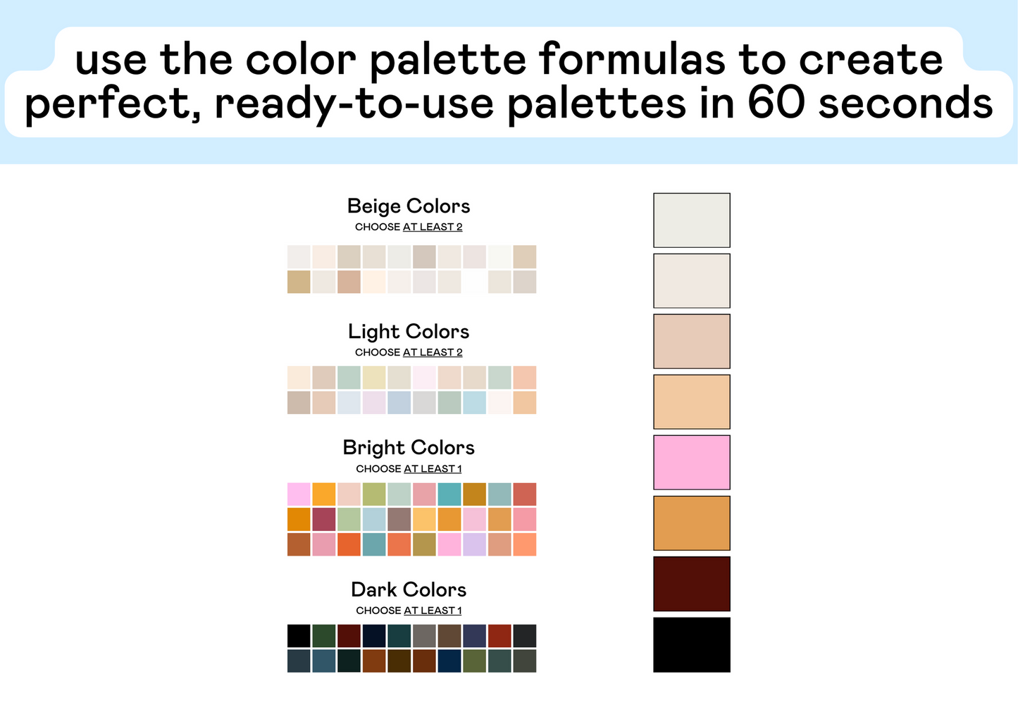
The next step is actually SUPER important: you have to decide how you want to use the colors in your palette.
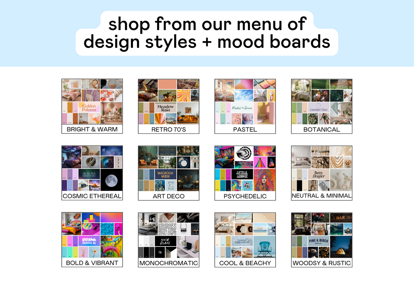
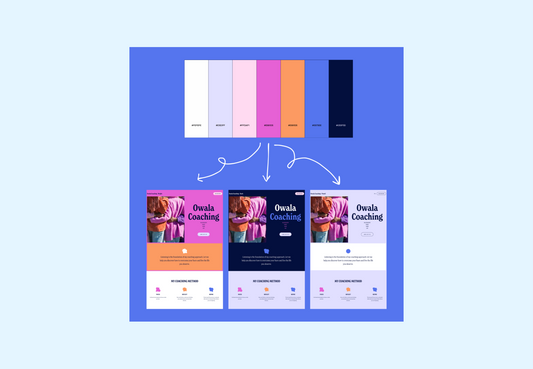
Let’s take a look at this brand color palette:

It’s playful, bright, and super fun. It’s got a great mix of light and dark colors (plenty of contrast options!). This palette is, as we say in the biz, good to goooooo.
But, HOW should the palette be used?
Here are 3 totally different ways to use this example brand color palette:


Option #1: Pastel
- Vibe: soft, nurturing, calming
- These color combos imply a sense of openness, kindness, and a gentle approach
Option #2: Bright
- Vibe: playful, energetic, modern
- These color combos imply a sense of creativity, fun, and friendliness
Option #3: Dark
- Vibe: luxury, formality, exclusivity
- These color combos imply a sense of sophistication, mystery, and serious transformational experiences.
Each option has a totally unique vibe just based on the way the colors are used. There’s no one ‘perfect’ way to use these colors: it just depends on the vibe of your project.
When you’re building your color palettes, be sure to take the time to intentionally choose which color combinations are the best representation of your brand’s vibe.
And, as always, have FUN with it. ☺